
All Projects / UIUX & Product Design
Renewed Vision:
ProContent website
Best known for ProPresenter, Renewed Vision launched ProContent to expand its subscription ecosystem. I designed the marketing website from the ground up, creating a cohesive experience that communicates the product’s value, improves content discovery, and aligns with the company’s evolving brand.
My Role
Product Designer (Sole)
Scope
Web Design
Duration
Januray - March 2024
Skills
UX/ UI Design, Responsive Design

// 01 Project Overview
ProContent is a media subscription library for churches — worship backgrounds, motion graphics, sermon series designs, social templates, and stock video — built to plug directly into ProPresenter so teams can pull content without leaving the app they already run services from.
// 02 Challenge
Translating an evolving brand into a cohesive digital experience
In 2024, Renewed Vision began introducing a new brand identity across its products. The updated guidelines established foundational elements — typography, color, visual principles — but the broader digital ecosystem was still taking shape. (Early 2024: partial branding system provided by Sweven.design.) At the start of the project, there wasn't yet a fully realized Renewed Vision website to reference, which left many interaction patterns and web-specific components undefined.
That created a unique challenge: how could ProContent embrace the new brand while staying flexible enough to evolve alongside the rest of the ecosystem? My goal wasn't simply to apply a style guide — it was to interpret an emerging visual language and translate it into a scalable marketing experience that could stand as a genuine extension of the new brand, not just a downstream application of it.
// 03 Problem
Three problems, one page, compounding each other.
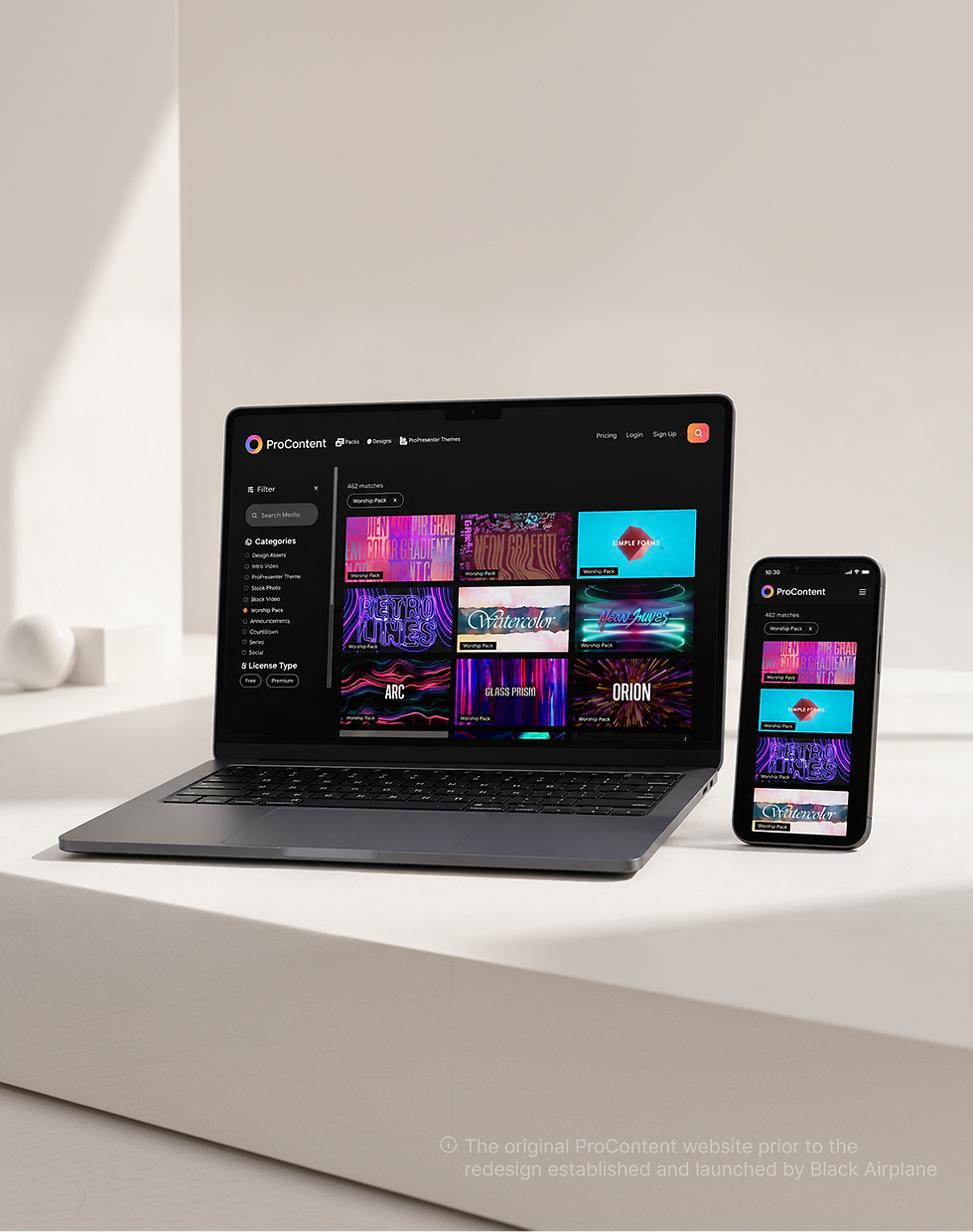
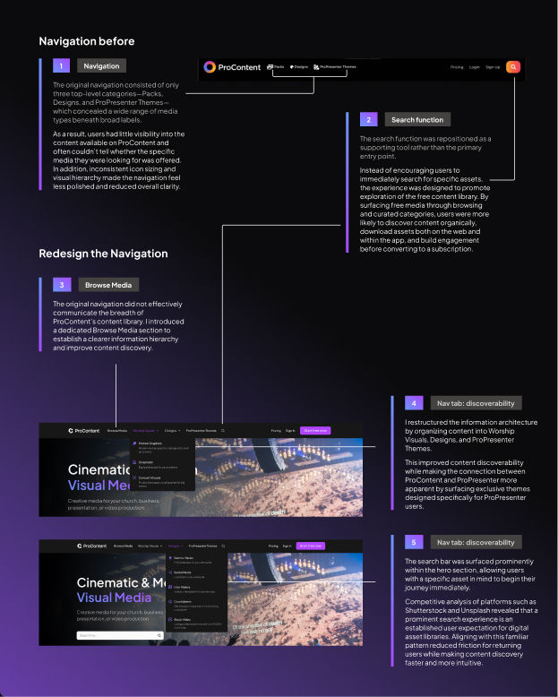
ProContent's site had drifted out of sync with the product it was selling. The visual identity looked dated next to newer, faster-moving competitors. The navigation buried the pages that actually mattered behind generic labels and unclear hierarchy — visitors couldn't tell where to go to understand what the product did. And the homepage itself wasn't converting: people landed, skimmed, and left before reaching anything that asked them to sign up.
None of these were separate issues. A visitor who couldn't find their way around a page that already looked unconvincing had no reason to stay long enough to convert.
(Early 2024: Partial branding system provided by Sweven.design)


// 04 Design Approach
Designing with limited guidance
With only a partial set of brand assets available, I focused on extracting the underlying principles rather than relying on predefined components. Typography, color, spacing, and motion became the building blocks I used to establish a visual system that felt aligned with the brand's direction while remaining adaptable as the wider Renewed Vision ecosystem evolved.
Throughout the process, I balanced three priorities:
→ Staying faithful to the new brand identity — even where it was only partially defined.
→ Creating a strong visual foundation for ProContent — a site that could stand on its own, not just borrow credibility from the brand refresh.
→ Designing flexible patterns that could accommodate future updates — so the site wouldn't need to be rebuilt again once the rest of the ecosystem caught up.
"The brief wasn't to apply a style guide — it was to help write the parts of it that didn't exist yet."


// 05 Outcome
A site that finally matched the product.
The clearest proof here is visual — the before/after speaks for itself. Internally, the redesign was well received by the team and stakeholders who'd been fielding "what does this actually do" questions from prospects.
// 06 Refecltion
What I'd do differently
→ I'd instrument the "before" state first. Without baseline analytics in place ahead of the redesign, I could speak to the qualitative shift but not to hard conversion numbers — a lesson I've carried into later projects.
→ Navigation is a content problem, not just a UI problem. The biggest single fix here wasn't visual — it was deciding what deserved to be one click away versus three.
Scope note: this case study covers the pre-authentication marketing site — the public-facing pages that introduce ProContent and drive signups. The post-authentication experience (browsing and downloading content once logged in) is still in progress, pending development resources for implementation.

// 07 Looking Ahead
Design exploration: simplifying authentication
While redesigning the marketing site, I noticed friction further downstream — in ProContent's post-authentication browsing and search experience.
Users often struggled to quickly discover, verify, and use the right media asset within a growing content library. Weak search, inconsistent organization, and limited preview and filtering tools were leading to lost productivity, duplicate content creation, and reduced trust in the platform overall. This wasn't part of the project's scope, but I explored what a more guided discovery experience could look like.
The concept focused on:
→ Improving search relevance and filtering, so users can narrow the library instead of scrolling it
→ Creating clearer, more consistent content organization across asset types
→ Adding stronger preview tools so users can verify an asset before committing to it
→ Reducing duplicate downloads and rework caused by poor discoverability
Current flow

