
All Projects / UIUX & Product Design
From owned to ongoing —
making the switch feel safe.
As ProPresenter shifted toward a subscription model, users needed a clearer way to understand what they owned, what changed, and how to manage access. I designed the Account Manager from the ground up to unify licenses, team management, and subscription transitions into one self-service experience.
My Role
UI/UX Designer (Sole)
Scope
B2B/ B2C/ Internal
Duration
2023 - 2024 Launch
2024-Present Refining
Skills
Product Design
User Research
Prototyping & Testing
// 01 Problem
Three types of users. Zero shared starting point.
ProPresenter's customer base didn't arrive at the subscription transition equally.
-
Legacy owners had paid once and felt they already owned the software.
-
New buyers had no history with the product and just wanted a clear path in.
-
Lapsed users had expired plans and were uncertain what migrating would cost them — or what they'd lose.
The account manager had to speak to all three without making any of them feel like an afterthought. The risk wasn't just confusion — it was churn at the exact moment users were being asked to trust a new model.
"How do you design one experience that feels right for someone who's been a customer for 10 years and someone who signed up yesterday?"


// 02 Reserach
What users actually needed to feel in control
Through synthesis of support ticket data, customer feedback on facebook community as well as internal user group on slack, one theme emerged: subscription anxiety. Users were afraid of losing something they'd already paid for, being charged unexpectedly, or not understanding what "migrating" actually meant.
This reframed the design goal. The account manager wasn't just a utility dashboard; it was a trust-building surface. Every screen needed to answer the question users were silently asking: "Am I safe here?"
// 03 Process
From user flows to final UI
I started by mapping user flows to each of the three personas — tracing every path from account creation through subscription management and team collaboration.
With a 5-month delivery window and a newly formed team, the priority was shipping a complete, working experience. Without a dedicated front-end developer to implement and maintain a design system, I moved directly into wireframes — iterating screen by screen to cover every flow the business needed to launch.
In hindsight, this was the right call for the timeline. But looking back, I'd establish even a lightweight design system before touching screens — a shared set of components and tokens would have reduced design drift across surfaces and made the handoff significantly cleaner, even without a dedicated developer to own it.


// 04 Design system
The design system wasn't part of the original plan — it became necessary after the first handoff to development. During the review process, I noticed something that wasn't visible in Figma: each developer had been pulling from their own component library. Buttons looked slightly different. Spacing was inconsistent. Form inputs didn't match across screens. The same UI, built three different ways.
That's when it became clear that a shared design system wasn't a nice-to-have — it was the only way to reduce the accumulating tech debt and give the team a single source of truth to build from. Even without a dedicated front-end developer to own and maintain it, the system needed to exist.
I structured it using Atomic Design Methodology — building from the smallest units up to full page compositions. Starting at the atom level meant every molecule, organism, and template that followed was guaranteed to be consistent, because they were all composed from the same base parts.


// 05 Solutions
Four flows. One cohesive experience.
The account manager became the backbone of ProPresenter's subscription transition — not just as a product feature, but as the surface that made the business model shift possible at scale.
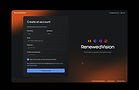
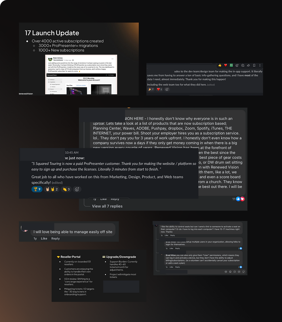
1. The onboarding and checkout flow was the front door of the subscription transition — the first moment users from all three personas had to decide whether to trust the new model. With 3,000+ new subscribers in the first two weeks, removing friction here had direct business impact.
2. The user account was the trust anchor of the entire product — the place users could come to confirm they were safe, see what they owned, and manage everything without contacting support. The 60,000+ migration seats story lives here.
3. The admin dashboard was designed for the Renewed Vision support team — giving them a unified view of any user's account without switching between tools. Before this existed, resolving a single billing ticket required navigating three separate systems.
Onboarding, legacy migration & checkout flow
// 05 Solutions
1. The onboarding and checkout flow
-
Plan selection
Guided decision flow helping users identify the right plan for their church or org size — addressing the top pre-purchase support question.
-
Checkout & confirmation
Clear, anxiety-free checkout — surfacing exactly what the user is paying for, when they'll be charged, and what they'll receive. Confirmation state designed to feel reassuring, not transactional.
-
Legacy migration path
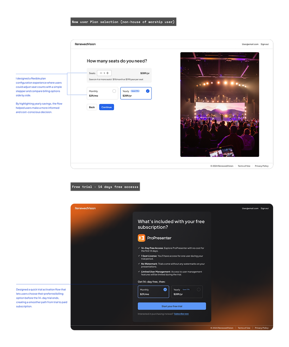
A dedicated flow for perpetual license holders — showing exactly what they currently own, what migration means, and what they'd gain. Language carefully reframed away from "migrate" and toward "bring your seats over."


// 05 Solutions
2. The user account features
-
Subscription status & renewal
To make subscription management more self-service, I surfaced plan status and renewal dates at the top of every session.
This gave users immediate visibility into their subscription without needing to contact support, making it easier to understand upcoming renewals, manage their plan, and take action with confidence.
This new version was also designed around a key billing constraint: users could not receive direct refunds for seat reductions, but could receive prorated credits toward their next renewal, so the flow needed to make those impacts clear before users confirmed changes.
-
Seat & license management
Full visibility into seat allocation, active users, and available capacity — critical for multi-operator church and event teams.
-
Product browsing & team invites
Add-on products and team collaboration tools surfaced contextually — not as a sales push, but as a natural extension of managing your account.
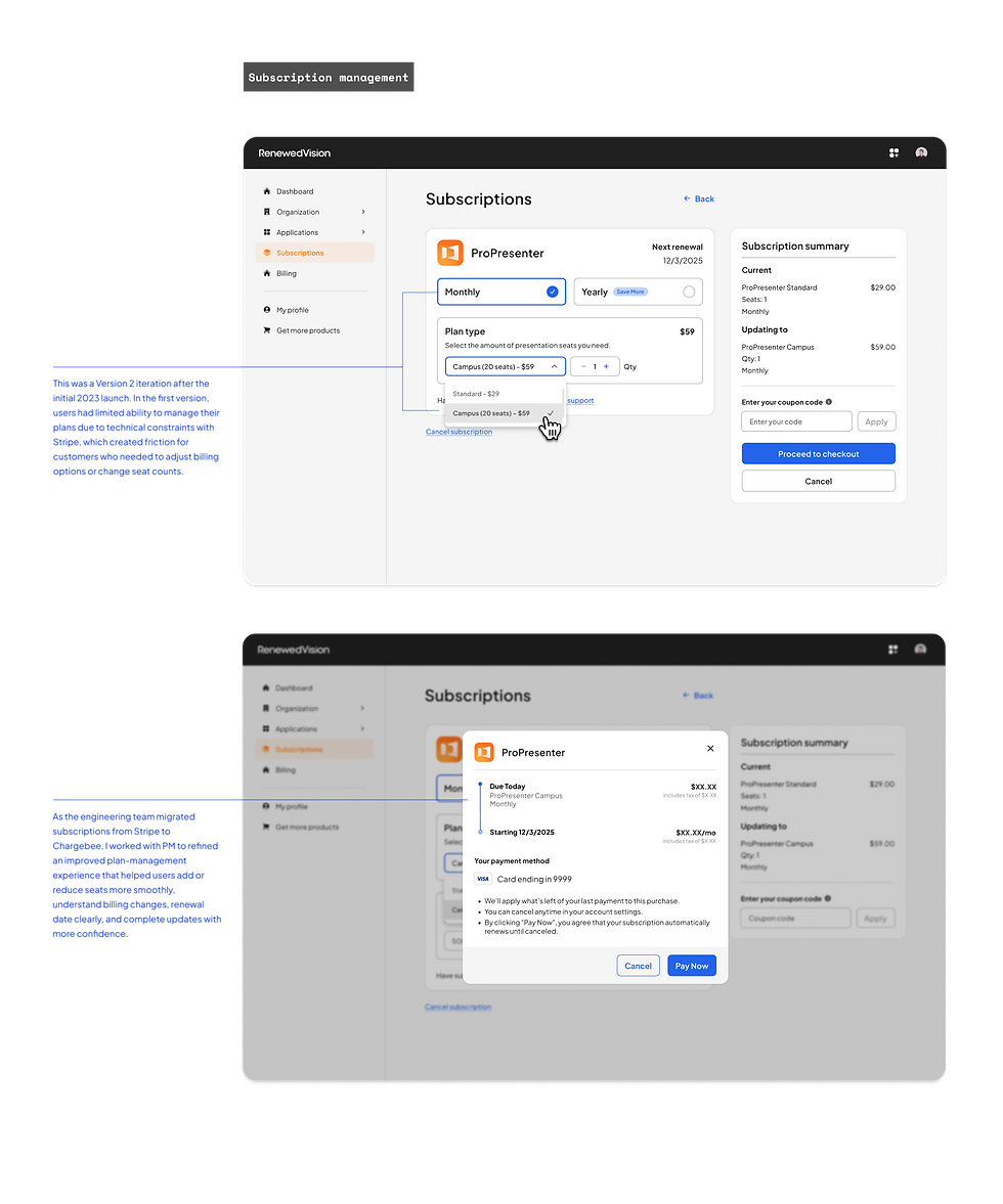


Subscription managment: Change plan

// 06 Design for iterations & outcomes
Within the first two weeks, the new experience drove 3,000+ new subscribers. The platform now supports over 102,700 active sessions every 30 days, with total seats reaching 100,000 by 2026. Most significantly, 60,000+ legacy seats migrated to the new model — users who had paid once and owned their software, choosing to trust the new experience. That number doesn't happen without a design they believed in.
There’s more to this project than what fits on one page.This case study focuses on two core user flows, but the full project included a much broader design scope: complex edge cases, cross-functional decision-making, and the full development cycle for both an internal admin portal and a B2B reseller portal.
I’d be happy to walk through the complete project in more detail during a call or interview.
// 07 Reflections
What I'd do differently
→ I would test with legacy users earlier. Words like “migrate” and “expire” carried more emotional weight than I expected, especially for users who felt ownership over their existing licenses. Earlier testing with real legacy customers would have helped uncover those concerns sooner and shape a more reassuring experience.
→ I would design empty states earlier in the process. New accounts with no billing history, no team members, or no licenses yet were handled later than they should have been. Designing those zero states upfront would have made the experience feel more complete and supportive from day one.
→ I also learned that a design system is not just a design deliverable. It is a development necessity. After the first handoff, I saw developers building from different component libraries, and the inconsistency showed up quickly in the product. A shared system, even a lightweight one, would have reduced design and tech debt, helped the team move faster, and created a more scalable foundation.
→ Most importantly, this project taught me to design with scalability in mind, even under tight timelines or unclear direction. By thinking ahead about future business needs, user growth, and engineering constraints, design can better support business goals, reduce unnecessary rework, and lower the cost of future iterations.
